matplotlib 绘图
ax1.legend(loc=‘upper center’, bbox_to_anchor=(0.3, -0.1))
ax2.legend(loc=‘upper center’, bbox_to_anchor=(0.6, -0.1))
import numpy as np
import matplotlib.pyplot as plt
from scipy.stats import norm
from scipy.interpolate import make_interp_spline
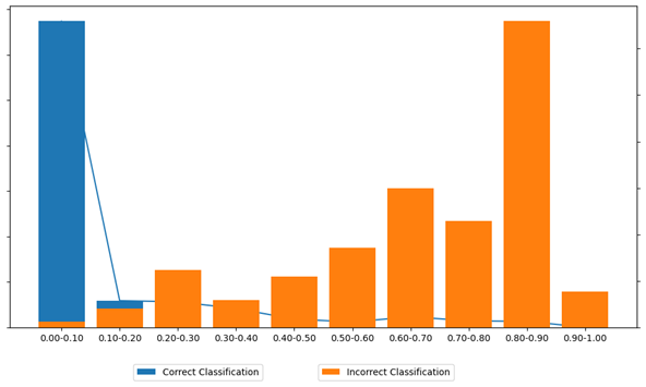
correct_samples={
'0.00-0.10': 33692,
'0.10-0.20': 2939,
'0.20-0.30': 2815,
'0.30-0.40': 2074,
'0.40-0.50': 912,
'0.50-0.60': 589,
'0.60-0.70': 1162,
'0.70-0.80': 721,
'0.80-0.90': 655,
'0.90-1.00': 14
}
incorrect_samples={
'0.00-0.10': 13,
'0.10-0.20': 40,
'0.20-0.30': 124,
'0.30-0.40': 59,
'0.40-0.50': 110,
'0.50-0.60': 171,
'0.60-0.70': 300,
'0.70-0.80': 229,
'0.80-0.90': 659,
'0.90-1.00': 77
}
labels = list(correct_samples.keys())
correct_counts = list(correct_samples.values())
incorrect_counts = list(incorrect_samples.values())
fig, ax1 = plt.subplots(figsize=(10, 6))
rects = ax1.bar(labels, correct_counts, label='Correct Classification', color='#1f77b4')
x = [rect.get_x() + rect.get_width() / 2 for rect in rects]
y = correct_counts
ax1.plot(x, y, linestyle='-', color='#1f77b4')
ax1.set_yticklabels([])
ax2 = ax1.twinx()
rects2 = ax2.bar(labels, incorrect_counts, label='Incorrect Classification', color='#ff7f0e')
x = [rect.get_x() + rect.get_width() / 2 for rect in rects2]
y = incorrect_counts
ax2.set_yticklabels([])
ax1.legend(loc='upper center', bbox_to_anchor=(0.3, -0.1))
ax2.legend(loc='upper center', bbox_to_anchor=(0.6, -0.1))
plt.grid(False)
plt.tight_layout()
plt.show()